


It’s often said that simplicity is the best sophistication and I reckon Facebook login is a perfect testimony to that statement. Several social networks existed before Facebook was launched but none of them managed to make a significant impact. Facebook changed the rules of the game and has proven to be a model success story for how you can leverage the best of social media while sticking to the “simple is good” principle.
A case in point is the Facebook Login page. While it’s easy to write it off as just another web page on the Internet, it beautifully sums up the simplicity approach adopted by world’s leading social network.
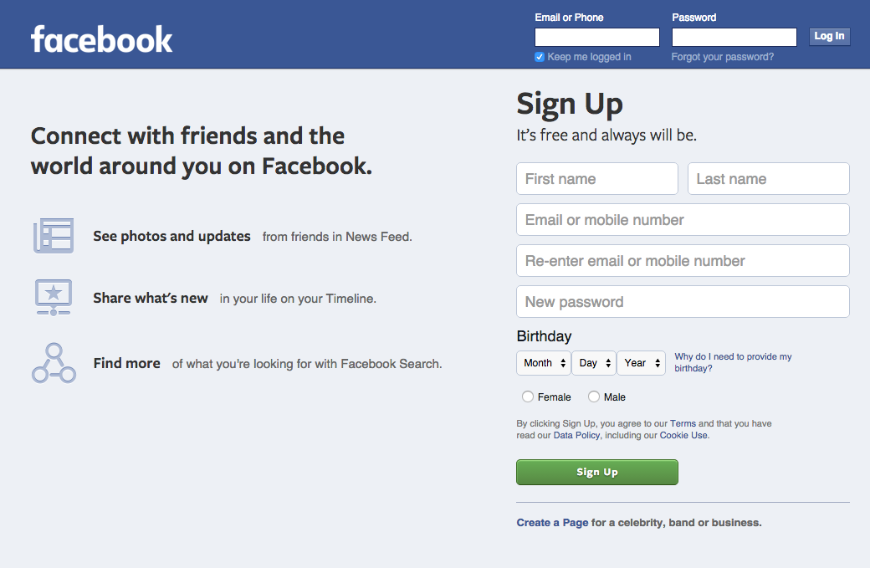
Facebook Login Page
Facebook has grown exponentially over the last couple of years and is quickly approaching the landmark of 600 million users. One of the major reasons why Facebook gets so many new users every day is the simplicity of its Login/ Signup page. If you are a new user, all you need to do is enter some basic information and you’re all set to join the Facebook bandwagon.
If you are an existing user, just enter your email/ password and get started. Moreover, if you’ve chosen the “Remember Me” option, you are directly logged in to Facebook.
Minimal Learning Curve with Facebook Login
If it’s too heard to learn, most users will shy away. Facebook quickly realized that and ensured that users need to go through a minimal learning curve in order to use its social network. Therefore, the login page has an intuitive UI which works even for layman users and for newbies who’re still finding their feet on the web.
Third Party Integration with Facebook Login
Once Facebook established itself as the numero uno social network, it became obvious that more and more sites would link to it. Therefore, the next logical thing to do was to let third-party websites integrate with Facebook. There is a wide array of powerful APIs which developers can use to create social experiences to drive growth and engagement on their websites.
You can add Facebook integration to your website in several ways including the Login Button, Registration Plug-in etc.
Facebook Login Button
The Facebook Login Button method is currently the most popular third-party integration approach. The idea is simple – The Login Button shows profile pictures of the user’s friends who have already signed up for your site in addition to a login button.
Developers have full control over the look and feel of login button. For example, they can specify the maximum number of rows of faces to be displayed.
From a user perspective, it’s handy as they do not need to login to your site. Moreover, being associated with Facebook, the world’s leading social network, adds credibility to third-party websites.
Do you think the simplicity of Facebook login page is part of their phenomenon success? Leave your thoughts below.
[et_social_share]

That article is so interesting and makes a
very nice image in my mind. Thank you for sharing this info with us!
I just want to say I am just new to weblog and honestly enjoyed you’re website. Likely I’m likely to bookmark your website . You amazingly come with exceptional articles. Thanks for sharing with us your web site.
Thanks , I’ve recently been searching for information about this subject for a long time and yours is the best I’ve came upon so far. However, what in regards to the conclusion? Are you positive concerning the supply?|What i do not realize is actually how you are now not really a lot more well-appreciated than you might be right now. You’re so intelligent.
I’ve said that least 688574 times. SCK was here
Spominam si na svoju prvu pani ucitelku Martusku Bartkovu. Mala krasne dlhe vlasy a bola velmi mila. Byvala na Spanej Doline. ktovie ako? sa jej dari dnes.
Hi, i think that i saw you visited my blog thus i came to ?return the favor?.I’m trying to find things to improve my site!I suppose its ok to use a few of your ideas!!
Quit!!!!Consider a deep breath and study some sensible tips for expert looking web sites.1. Select a color scheme and adhere to it. If your [url=http://www.newmiumiushop.com/] ミュウミュウ 直営店 [/url] company has a logo or favored colors on its stationery thats a good start. For these of you beginning from scratch, select two or three complementary colours and stick with them dont change colors on every web page. The most common colour schemes [url=http://www.discountmbtsjp.com/] mbt スタジオ [/url] include:Red, yellow and [url=http://www.newmonclerjacketsdown.com/%E3%83%A2%E3%83%B3%E3%82%AF%E3%83%AC%E3%83%BC%E3%83%AB-%E3%83%AC%E3%83%87%E3%82%A3%E3%83%BC%E3%82%B9-c-61.html] モンクレール レディース ダウン [/url] whiteBlue and whiteRed, grey and [url=http://www.newmarcbymarcjacobsjp.com/%E3%83%9E%E3%83%BC%E3%82%AF%E3%82%B8%E3%82%A7%E3%82%A4%E3%82%B3%E3%83%96%E3%82%B9-%E3%83%90%E3%83%83%E3%82%B0-c-11.html] マークジェイコブス バッグ [/url] whiteBlue, orange and whiteYellow, grey and white.If youre not certain what color scheme to choose, surf the internet and find a website that you like. You can then model your colour scheme on what already exists. 2. Use templates.Cant discover a web site you truly like? An additional choice is to choose a template. There are many templates or pre-established designs. These come as component of your web design software (such as FrontPage) or you can check out some web sites that specialise in creating templates. Visit:www.web4business.com.au/templates1.htmwww.newtemps.comwww.web site-templates-resale-rights.comwww.123webtemplatesandmore.com3. Offer an simple to use navigation system.This is 1 of the most important problems to think about when creating a website. You require to ensure your visitors can find what they are looking for effortlessly. Most websites both display their navigation bar on the left or at the top. And because most people are utilized to this kind of navigation, its best to adhere with it.It also assists to include your navigation bar at the bottom of each page to save your guests from having to scroll back again to the leading.four. Dont go overboard on unique effectsWhilst it [url=http://www.newmonclerdownsjp.com/%E3%83%99%E3%82%B9%E3%83%88-c-100.html] モンクレールダウンベスト [/url] is okay to have one or two special results to jazz up your website, spinning graphics and logos often distract your customer from the content, not to point out they can consider too lengthy to download. Your guests might click absent even prior to your spinning logo finishes loading. five. BackgroundsEnsure your visitors can study the text on the background, ie. no black writing on darkish blue background or yellow on white colored. Also be cautious that your links are visible prior to and following being visited. The default for links in most applications is blue (before becoming visited) and burgundy (following becoming visited), so if you have a dark track record, make sure your hyperlinks are mild.six. Exterior LinksIt is a good concept to open hyperlinks to other web sites in a new window. That way your visitors can easily [url=http://www.jptimberlandsale.com] ティンバーランド 通販 [/url] return to your site when they are finished browsing the [url=http://www.newmiumiushop.com/] miu miu 店舗 [/url] exterior link7. Website Map & Research FeatureIf you web site is much more than 15 pages, it is helpful to have a site map or a Research” function to ensure your visitors can easily discover what theyre searching for.8. Content material is KingWhile it is essential that your web site looks clean and expert, it is far more important that you focus your efforts on the content and marketing. If you want a professional web site, things to [url=http://www.miumiujpoutlet2013s.com/] ミュウミュウ バッグ [/url] stay away from consist of:Flash intros, revolving globes, bevelled line separators, animated mail boxesLoads of pop up or pop under boxesAutoplay music. Permit your customer to perform songs only [url=http://www.newtoryburch2013.com/%E3%83%88%E3%83%AA%E3%83%BC%E3%83%90%E3%83%BC%E3%83%81-%E3%83%88%E3%83%BC%E3%83%88-c-101.html] トリーバーチ トート [/url] if they select. Hit counters of the totally free variety, which say you are twenty seventh visitor”Date and time stamps, unless your web site is updated daily or weeklyBusy backgrounds.Dont sweat the little stuff and get yourself focussed on what to include on the web site and the best way to promote it. We will cover these subjects in long term articles. Copyright 2004 Ivana Katz
I am in fact happy to read this web site posts which consists of lots of useful facts, thanks for providing such statistics.
Have you given any kind of consideration at all with converting your current site into Spanish? I know a couple of of translaters right here that would help you do it for no cost if you wanna make contact with me.
Hello would you mind stating which blog platform you’re working with? I’m planning to start my own blog in the near future but I’m having a tough time deciding between BlogEngine/Wordpress/B2evolution and Drupal. The reason I ask is because your design and style seems different then most blogs and I’m looking for something unique. P.S Sorry for being off-topic but I had to ask!
Wanted to drop a remark and let you know your Rss feed isnt working today. I tried including it to my Google reader account and got absolutely nothing.
Re: The person who produced the comment that this was a great website truly needs to get their head inspected.
I’d have to check with you here. Which is not something I usually do! I enjoy reading a post that will make people think. Also, thanks for allowing me to comment!
hello to both of you.. well the cheese that you mention is not available? in my near grocery store, could you suggest me some other cheese that might work with this wonderful dish thx
?? ???????????? ????? ???????? ????????? ?????? , ? ?? ????? ?????? ???????? ?????., ?? ???-?? ???????, ??????? ?? ?? ???.
This really answered my problem, thank you!
I have got 1 idea for your website. It appears like at this time there are a number of cascading stylesheet troubles when launching a selection of webpages inside google chrome as well as opera. It is functioning okay in internet explorer. Possibly you can double check that.
Just discovered this site through Google, what a pleasant surprise!